Matilde Ficozzi - PhD candidate, University of Groningen; Research assistant, Aalborg University
Mathieu Jacomy - Assistant Professor, Aalborg University
Dario Rodighiero - Assistant Professor, University of Groningen
Anne Beaulieu - Professor, University of Groningen
Anders Kristian Munk - Professor, Technical University of Denmark
“Aucune chose n’est par elle-même, réductible ou irréductible à aucune autre.” — Latour, B. (1984). Irréductions.
Abstract
Data visualization is emerging as a mechanism to make expert knowledge accessible, bridging the gap between research institutions and the broader public. However, scientists must be cautious, as visualizations can oversimplify or misrepresent information, inadvertently widening this gap (Drucker, 2021). While visual abstraction can enhance inclusion, it alone is insufficient; effective mediation of knowledge requires designing encounters that enable audiences to inhabit and explore semantic spaces. In this process, data visualizations function as cognitive prosthetics for viewers, redistributing the epistemic labor of making sense of the world.
The proposed case study exemplifies this approach by mapping AI scientific literature into a tangible and experiential format. Such scientific literature is physicalized at Danish Technical Museum as a 100 m² floor mat, inviting audiences to explore through walking. The “Grounded AI Map” analyzes millions of scientific articles, transforming them into annotations summarizing the most important topics around artificial intelligence (Munk et al., 2024). Those annotations are then LLM-summarized and embedded in automated bots, which mediate between the representation and the viewers by assessing the nature of knowledge abstraction. Inspired by the concept of counter-AI by Chateauraynaud (2019), in the case study AI methods interrogate their own epistemic structures rather than uncritically amplifying algorithmic outputs. By positioning AI as an object of reflexive critique, this approach aligns with the broader sociological effort to reintroduce multiple perspectives into digital knowledge infrastructures. Extending this logic of critique and engagement, the automated bots are also made accessible via a smartphone app, enabling audiences to interact with the LLM-generated insights, question their framing, and actively reinterpret the mapped knowledge through their perspectives (Jensen et al., 2021).
By fostering exchanges, the automated bots transform the map into a participatory space, where knowledge is co-constructed between visitors (Rodighiero et al., 2022). A quali-quantitative framework evaluates the mediation quality in the case study. Quantitative analysis of the app reveals the audience’s interests, while the qualitative observation of social interactions captures how visitors make sense of the space. Additionally, open-ended interviews provide insight into how visitors interpret, reprocess, and re-appropriate the exhibited knowledge on their terms. The findings highlight the situated nature of visualizing and abstracting knowledge, as the exhibition renders visible the negotiation between the visualization and the public’s perspective. Understood as a hybrid infrastructure that naturalizes scientific knowledge into an undramatic yet multifocal artifact, this experiment suggests how LLMs’ epistemic flexibility could reshape the ways we construct and interpret a shared understanding of the world.
Introduction
Data visualisations often communicate a clear message, condensing complex information into a readable and understandable form. However, in some cases, instead of presenting a conclusion, they invite a different kind of engagement, one where meaning is not given but negotiated. This assumption raises a question: how can audiences engage with a visualisation that has no message to convey? This text adopts a dialogic perspective to investigate the apparatus that turns the visualisation viewer into an active participant in the transfer of knowledge. This approach is explored through the case of the Grounding AI Map, a large-scale data visualisation that transforms scientific literature into an exhibition format, inviting the audience to shape knowledge as they explore it.
The Grounding AI Map is a network visualisation printed on a 100-square-meter floor mat for the Danish Technical Museum in Helsingør. It visualises a dataset extracted from Scopus, comprising two million scientific articles on algorithms, artificial intelligence, and machine learning, published between 1985 and 2024. The map represents this vast corpus using clusters spatially organised by semantic similarity. To support exploration, the clusters are annotated using large language models, which act as research companions of the audience who explores the map through a dedicated app with automatically generated slanted opinions. In this way, AI plays a three-folded role in the project: as a tangible object of observation, a computer-generated mapping algorithm, and a prompt for critical reflection. Rather than conveying a fixed message, the Grounding AI Map encourages interpretation, fostering engagement with AI in its many forms.
This text focuses on how researchers can make their work accessible to the generic public. The Grounding AI Map project addresses this challenge by engaging the audience through visual exploration. Rather than leading viewers toward a single interpretation, it invites them to walk, look at, and reflect. This deeply explorative approach brings to light broader issues that arise when researchers attempt to design visualisations that open up questions rather than close them. Engagement is not only shaped by the visualisation itself but also by its situatedness—in our case, through annotations, an interactive app, physical presence, and the context of a museum space.
Grounded in Actor-Network Theory, this article is structured in four parts. Each section focuses on one element of the project and links it to a key concept from the ANT framework. The first part explores abstraction, describing how patterns emerge from data through spatial organisation. The second part turns to irreduction, examining how annotations preserve complexity rather than simplify. The third discusses mediation, focusing on the app and its role in guiding interpretation. Finally, the fourth part reflects on assemblage, looking at the physical exhibition and its interaction with the museum collection and curatorial choices. Together, these sections show how the Grounding AI Map functions as a layered apparatus, inviting audiences to co-construct meaning rather than receive it.
Map (Abstraction)
Abstraction, etymologically meaning “to drag away, detach, or divert” (ref), is central to the field of information design. In the context of data visualisation, it refers to the process of selecting and representing chosen subjects of study or specific aspects of data, while leaving others aside. The designer has to decide what to show, what to leave out, and how to structure what is left. These choices determine what information becomes visible and what information stays hidden. In this sense, abstraction is not a neutral operation at all: it influences how knowledge is presented and interpreted—it can be called knowledge design (Schnapp 2013). By identifying specific elements and arranging them meaningfully, visualisations reduce the initial data to give the viewers the opportunity to understand something that wouldn’t be accessible otherwise.
This process of abstraction is visible in the field of science mapping, a discipline that aims to describe the science in the making (Latour and Woolgar 1986). Typically in the field, scientific articles are analysed and transformed into visual representations to reveal the structural alliances between scholars and institutions, which are usually not visible in publications themselves. From its origin, to design explanatory visuals, science mapping has relied on established metrics such as mapping co-authorships or bibliographic coupling (Börner et al. 2005; Chen 2017), but more recent approaches use natural language processing to detect text similarities, offering a different way to analyse corpora (González-Márquez et al. 2024; Noichl 2023).
As a result, any science map represents a form of abstraction. This is true not only for geographical maps but also for non-geographical ones—such as network maps, self-organizing maps, or embeddings created through dimensionality reduction—which all share this abstracting function. Unlike more conventional charts, these maps reveal structures through spatial cues like density and distance, making visible features such as clusters, structural gaps, or centre–periphery relations. The Grounding AI Map is one such example, offering a spatial perspective on the organisation of scientific knowledge about artificial intelligence.
Non-geographical maps also have the distinctive ability to prompt questions rather than provide definitive answers. Unlike explanatory visualisations that convey a fixed message, these maps are created by researchers to actively explore complex data—a capability not typically aligned with hypothetico-deductive methods that rely on pre-formulated hypotheses. As Tukey describes (1977, Vol. 2, pp. 131-160), exploratory maps expose viewers to new insights, often taking the form of further questions rather than concrete evidence—this interpretative openness depends heavily on the viewer’s subjectivity. Echoing Dewey (1938), Munk et al. (2019, p. 112) suggest that data-driven inquiries often “question the initial frame,” emphasizing that exploratory visualisations frequently generate more questions than they answer.
The Grounding AI Map is an example of a non-geographical, exploratory visualisation. Created through an embedding model (Cohan et al., 2020) combined with a dimensionality reduction technique using a k-nearest neighbours network (Cover & Hart, 1967), the map organises scientific articles on AI based on their semantic similarity. Although the visualisation is technically a network, it does not explicitly depict connections as lines; rather, relationships between documents are indirectly visible through their spatial positioning (Rodighiero and Romele 2022), determined by a force-directed layout algorithm (Jacomy et al., 2014). The resulting clusters are semantic abstractions, groups of documents sharing similar content. Crucially, as all the non-geographical maps, the Grounding AI Map does not aim to communicate a specific message or conclusion. Instead, its design deliberately preserves openness, prompting audiences to explore, question, and engage in dialogue.
Creating the Grounding AI Map involves five clearly identifiable steps. First, a corpus of approximately two million scientific articles is collected from the Scopus database. The query targets documents that include the terms algorithm*, AI, "artificial intelligence", or "machine learning" in either the title or the abstract. This initial selection criterion aims at capturing “what algorithms are doing in science.” The limitations of this query are acknowledged. Previous iterations of the map, presented to researchers across disciplines, have drawn attention to the partial nature of the query. Despite this, the decision is made to retain a general scope. Expanding the query to include field-specific vocabulary risks over-representing the research team’s existing knowledge while still missing less familiar or emerging uses. As a result, the query is deliberately limited, with the recognition that it yields an incomplete yet broadly representative view of algorithmic discourse in scientific literature. Second, a relational system is established to reveal connections between articles using text analysis and natural language processing techniques. Each article is represented as a node organised by semantic similarity, enabling readers to access individual documents while visualising the overall relational structure of the corpus. Third, an embedding technique is applied, mapping documents spatially according to semantic proximity. Visually, this approach generates clusters that reflect distinct scientific areas, with varying sizes and proximities, thereby supporting audience interpretation of artificial intelligence research.
In the fourth step, the design of the Grounding AI Map focuses on graphic choices that enhance clarity and visual appeal, which is essential for navigating such a large-scale map. Each document appears as a colored dot, with the color indicating its year of publication, forming a gradient from red (older) to blue (newer). Hill-shading techniques are employed to make clusters visually prominent, imparting a familiar geographical aesthetic while conveying relative sizes and densities. Additionally, clusters are highlighted with labels generated through an annotation protocol based on large language models. These annotations provide titles and summaries that guide audience interpretation. Finally, the map is physically printed as a large-scale artifact, giving tangible form to the data. This decision introduces challenges related to image resolution, printing materials, format, and transportation. However, transforming the map into a physical, explorable landscape enables the audience to interact with the data directly—walking across it, observing distances, and zooming in or out physically—thus influencing engagement through scale and movement (figure 1).
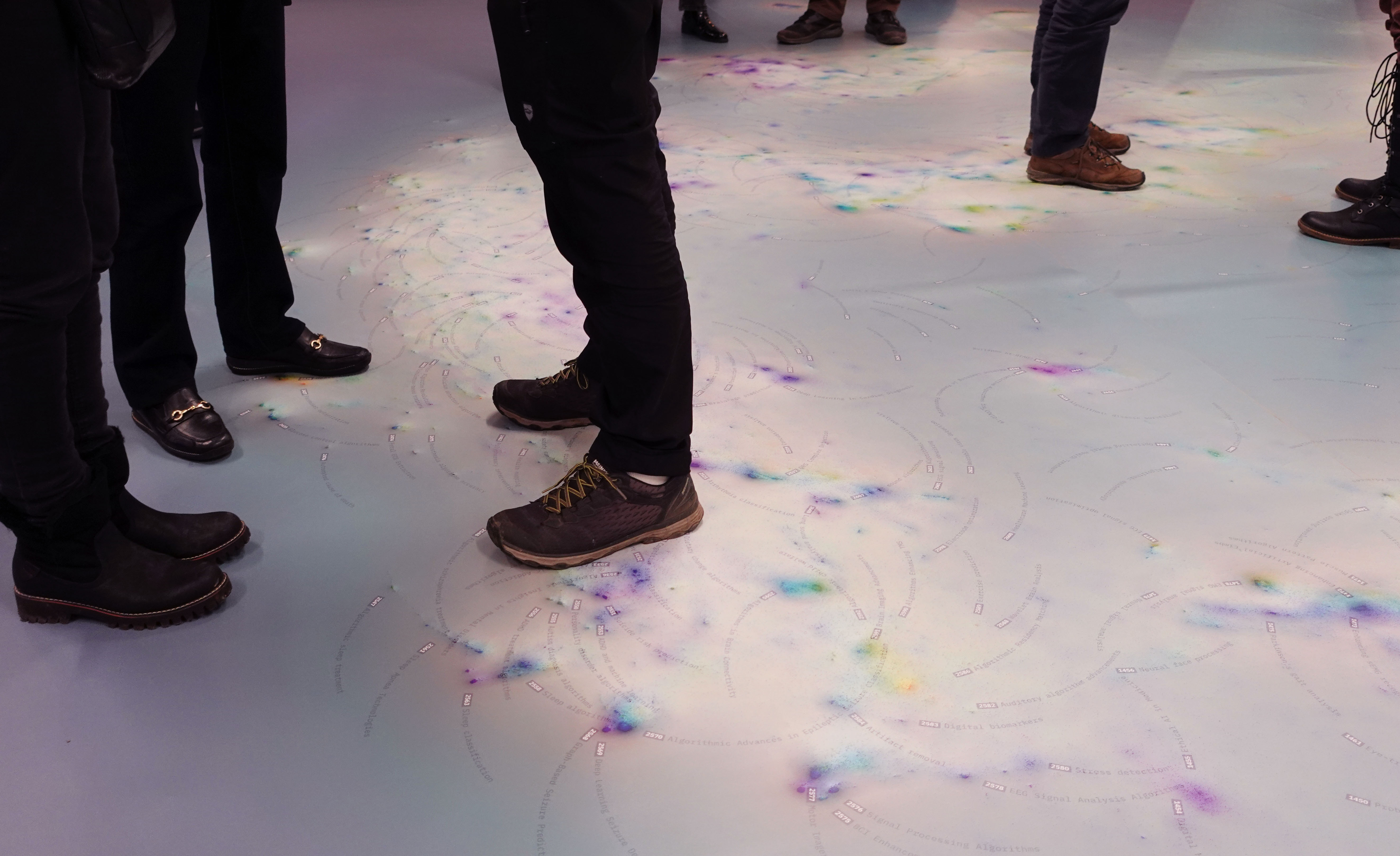
Figure 1. Visitors walking on the Grounding AI Map
To conclude, the concept of abstraction comes back into focus: the Grounding AI Map functions as a mechanism of abstraction for an extensive corpus of scientific literature. However, abstraction inevitably raises questions of intelligibility: how can the complexity of scientific knowledge remain understandable without succumbing to oversimplification? The next section addresses this critical challenge through the concept of irreduction, examining how annotations can preserve complexity while enhancing accessibility.
Annotation (Irreduction)
Creating a map from scientific literature inevitably involves processes of abstraction, which implies some choices of reduction. However, in the case of the Grounding AI Map, the original data points are not simply reduced into clusters. Instead, they become central elements in constructing annotations, which have the role of significantly limiting information loss and amplifying the visualisation. As a result, annotations are added as an interpretative layer to the walking visualisation, without affecting the benefits of the visual abstraction. This reversibility allows the audience to move between the annotation and the visualisation, choosing which level of detail they wish to engage with. By preserving the complexity of the individual data points, the annotations remain open to scrutiny, encouraging the audience to question their appropriateness. In this sense, annotations serve not as definitive answers but as points of entry, keeping the underlying questions alive.
Annotation, broadly understood, is a dynamic practice connecting readers, texts, and contexts through meaningful interaction. Kalir and Garcia (2021) describe annotation as not merely explanatory notes but as a form of active dialogue—a way readers “talk with their texts, to their texts, about and beyond texts.” Rather than existing in isolation, annotation generates intertextual relationships, establishing connections across multiple layers of meaning. It acts as a communicative gesture that provides context, illuminates hidden perspectives, and initiates conversations among readers, authors, and texts. Thus, annotations become integral to shaping knowledge, not by manipulating original content but by enriching it through the inclusion of new voices, interpretations, and engagements.
The annotation process for the Grounding AI Map addresses a critical challenge: the map itself, derived from highly specialised scientific texts, is not immediately relatable or accessible to general audiences. To overcome this, a specific annotation protocol was developed, leveraging artificial intelligence to generate contextual labels that maintain the complexity and richness of the underlying data. Unlike conventional mapping techniques, which often oversimplify information into uniform clusters, this approach strikes a careful balance—it simplifies content sufficiently to support readability without reducing nuanced research insights into generic narratives of technological advancement. Annotations thus serve as points of entry, providing clarity while preserving the map’s capacity to provoke exploration and interpretation (figure 2).
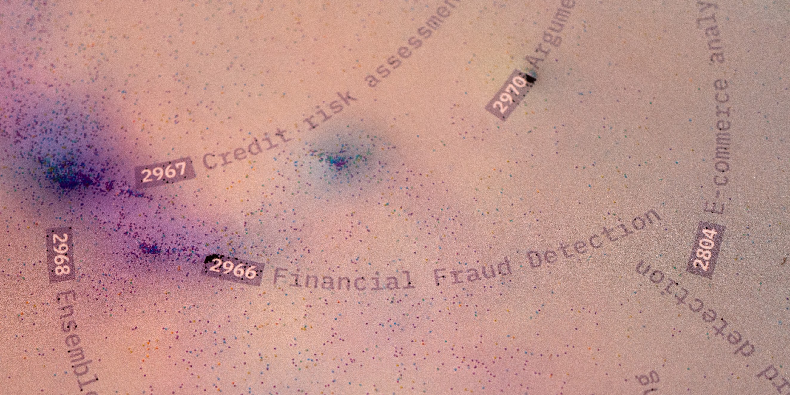
Figure 2. Detail of annotations on the Grounding AI Map.
Involving AI at the annotation level aligns closely with Francis Chateauraynaud’s (2019) concept of “counter artificial intelligence.” Simply put, this approach represents a counter-program to the predominant vision of AI, as promoted by influential proponents such as OpenAI, who aim at automating and replacing humans in as many contexts as possible. Chateauraynaud states: “Rather than pursuing autonomous machine development, these AI methodologies aim to test hypotheses and inquiry logic. … The conceptual reference point lies in … counter-expertise or counter-power. The objective is to re-situate artificial intelligence within a critical framework, thereby avoiding the risk of contributing to a fully realised form of digital nonsense—disconnected from real-world contexts—by remaining captivated by algorithmic capability” (Chateauraynaud, 2024, our translation). In this project, rather than allowing AI to independently simplify the complex landscape of artificial intelligence, AI is used specifically to facilitate—not replace—human interpretation. The AI-generated summaries supplement rather than substitute the original scientific papers. By annotating instead of reducing, human interpretation remains central, retaining the detailed information necessary for critically engaging with or even disagreeing with AI-generated outputs.
While annotations enrich the layer of the map, the experience of interpretation becomes one of the central elements through mediated interactions. This brings us to the role of the app as a tool for elicitation and critical dialogue.
App (Mediation)
At first glance, the vastness of the map contrasts with one of the main goals of data visualisation: offering a representation that allows viewers to access specific knowledge easily. Instead, the Grounding AI Map presents a scale that resists immediate understanding, calling for tools that support navigation rather than deliver answers. This approach reflects a fundamental commitment: to foreground complexity rather than to obscure it through oversimplification.
The exhibition space is designed so that visitors, standing directly on the map, can read the cluster titles near their feet and grasp those within their immediate movement. As the gaze moves outward, however, the readability fades. Titles blend into the broader visual field, merging into the geography shaped by the data. This partial visibility is not a flaw but a deliberate choice: the map’s vastness conveys the scale of the literature it represents and reminds viewers of the impossibility of grasping such complexity in a single glance.
The app (figure 3) was created as a tool for mediation, offering support for navigating the map and engaging in dialogue with it. The map itself acts as a mediator, not a message. The goal is not comprehension through simplification but exploration through interaction. Once the app is in use, it changes the experience: the user becomes part of an assemblage with the app and the map. This assemblage is where mediation happens.
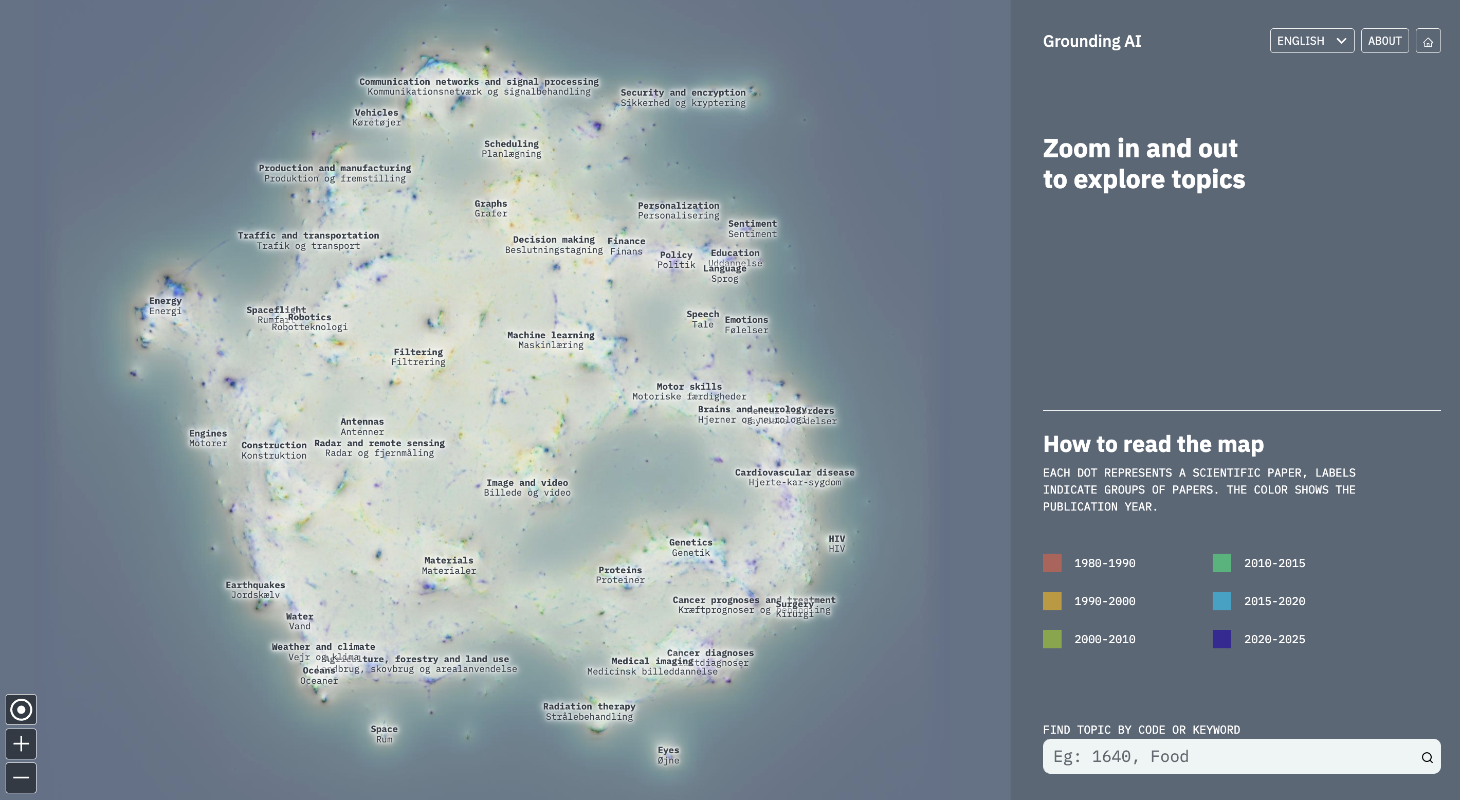
Figure 3. “Explore the map” section of the web-app
One of the central features of the app is the slanted bots (figure 4), animated textual agents that the users meet when they open a cluster summary. Each bot presents a distinct personality: one reflects an optimistic, progress-oriented reading of the scientific domain, while the other assumes a more sceptical, critical posture. Rather than resolving ambiguity, these bots heighten it, presenting interpretations that are intentionally partial and situated. Their synthetic opinions prompt visitors to confront the instability of knowledge claims, and invite them to form an opinion themselves. In this way, the bots act not as guides but as provocateurs, opening a space for critical engagement rather than offering closure.
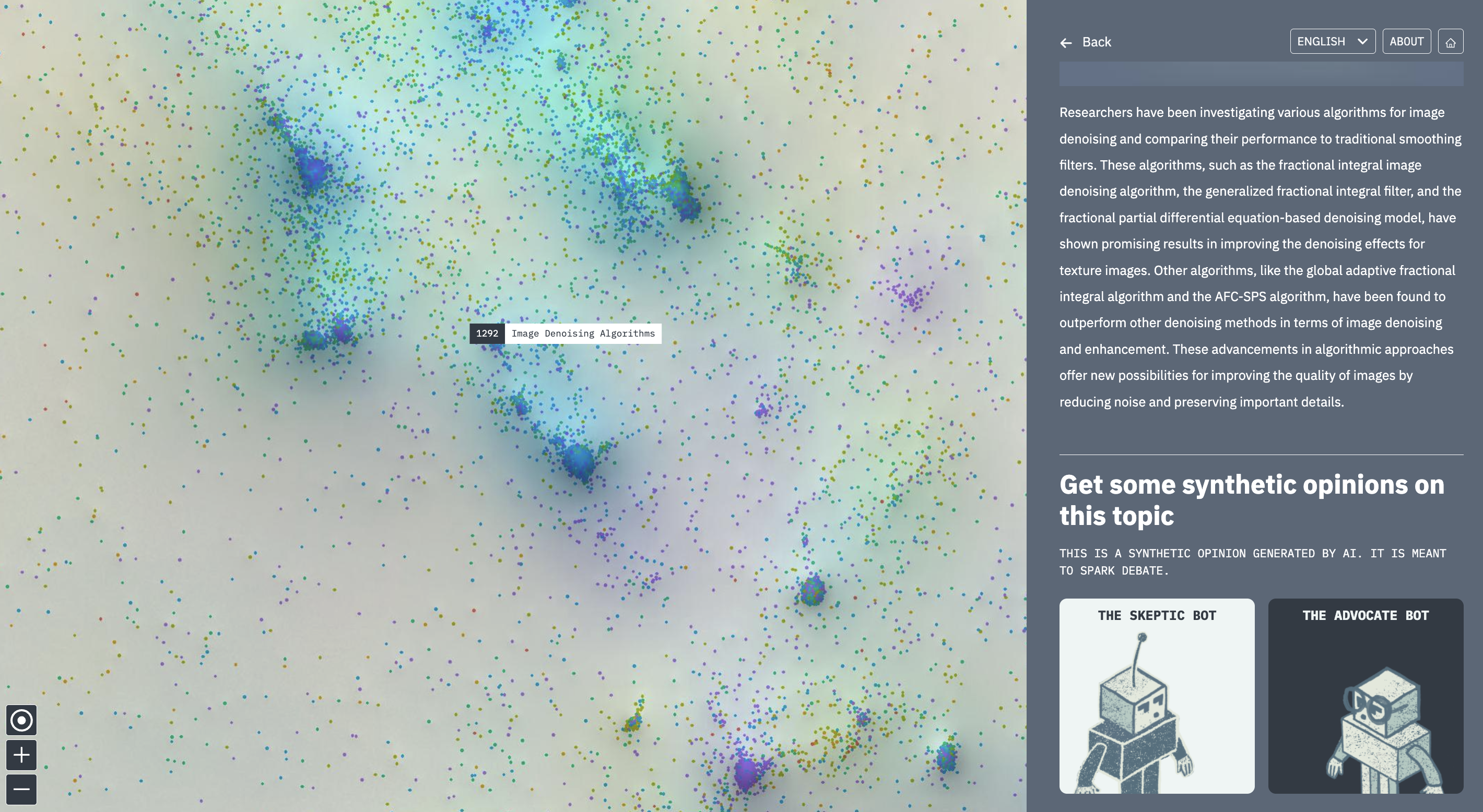
Figure 4. When opening a summary, the users are met with the slanted bots.
This added layer encourages negotiation of meaning. The bots offer differing perspectives, making it possible for the viewer to challenge what is presented and reflect on their own stance. Once access to knowledge is facilitated, a process of reinterpretation and re-appropriation begins, where understanding is shaped by dialogue, not by closure.
Yet mediation does not occur in isolation. It is deeply shaped by the physical and institutional context in which the map is encountered. The museum space itself becomes an active participant in the process of meaning-making, framing the interaction between visitor, map, and app. In the final section, we turn to how the broader curatorial conditions and the museum itself modulate this experience, becoming an active ally in shaping the knowledge encounter.
Physicalisation (Alliance)
Data Visualisation is often an object that is published on the web, leaving the accessibility open to a vast public. However, when viewers are interacting with a personal computer in their houses or offices, it’s impossible to say how they behave, or even more interestingly, we cannot guide them in using data visualisations, especially when they are complex objects or interfaces. Yet what we can draw from Latour’s legacy is that we can rely on alliances that can help us in fully interacting with the audience.
In that sense, institutions like the Danish Technical Museum can be seen as allied. Museums, as many other institutions, can connect the data visualisation to a specific public by offering a public space in which the interaction takes place. This type of alliance is fundamental when we talk about data physicalisation, as such a controlled environment offer us a two-folded goal: from one hand, it allows us to speak with the public and guide them in the consumption of knowledge; form the other hand, it allows the designers to observe how the audience relates with the data visualisation: the spectator itself covers an active role, being not a passive actor in the knowledge transfer but representing an actor taking part to the whole mechanism of learning publicly (Rodighiero 2018).
At the Danish Technical Museum, visitors are invited to explore the scientific landscape of artificial intelligence in different ways. The Grounding AI Map occupies 100 square meters in one of the museum rooms, inviting visitors to walk on it. A series of posters working as a system of wayfinding (Figure 5) helps visitors to understand the process of design and the ways in which they can interact with the map. One of these techniques relies on the app that visitors can access using their telephone, letting them discuss specific topics represented in the visualisation. The map, the viewers, the system of wayfinding, and the app compose a mechanism of learning through discussion in a very Freire way to transfer knowledge by engaging with dialogue (Freire [1970] 2000).
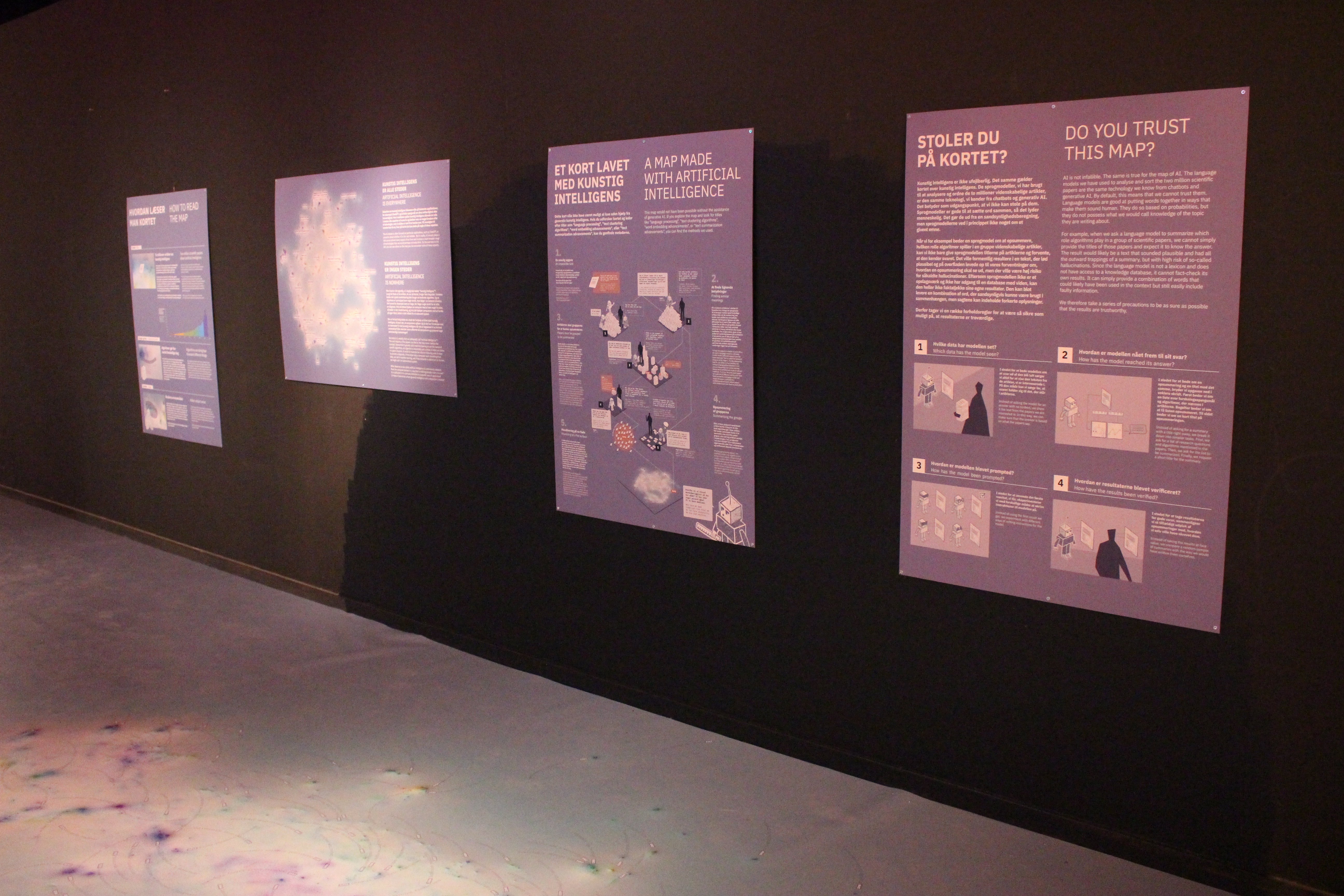
Figure 5. Posters from the exhibition that explain the design and methodology behind the Grounding AI Map.
Differently from previous experiments (Rigal and Rodighiero 2015; Rodighiero 2021; Rodighiero et al. 2022), the Danish Technical Museum also offered the opportunity to contextualise the map within their collection, developing a further level of connectivity in the exhibition space. Here, the exhibition is built around the map, both conceptually and physically. The map precedes the exhibition, as a self-contained visualisation of scientific discourse around AI and algorithms. It doesn’t require additional framing to be meaningful. Instead, the exhibition develops in response to it, using the map as a foundation to create a narrative that resonates with the museum context. This relationship is made tangible in the space: the map covers the entire floor, occupying 100 square meters, inviting visitors to walk across it. Their movement becomes a form of engagement, positioning them inside the knowledge landscape that the map represents.
Around this area, the exhibition grows through displays that present artifacts from the museum’s collection (figure 6). These objects trace how specific practices and technologies have evolved from analog to algorithmic forms and applications. These thematic pairings were developed collaboratively with the museum’s curators. Drawing on their deep understanding of the collection, and our familiarity with the map’s structure, we selected regions of the map and anchored them with physical objects that would be representative of the research field and relatable for the audience. The curatorial strategy here is not simply illustrative, it is translational. This translation helps bridge the distance between abstract terminology and everyday understanding. Many cluster labels on the map use academic or technical language, terms that may not be intuitive to a general audience. When placed alongside a physical object that embodies the function or context of those terms, the map becomes easier to navigate. Objects provide a point of entry, offering a way for visitors to recognise, relate, and begin to interpret a field they might otherwise find opaque.
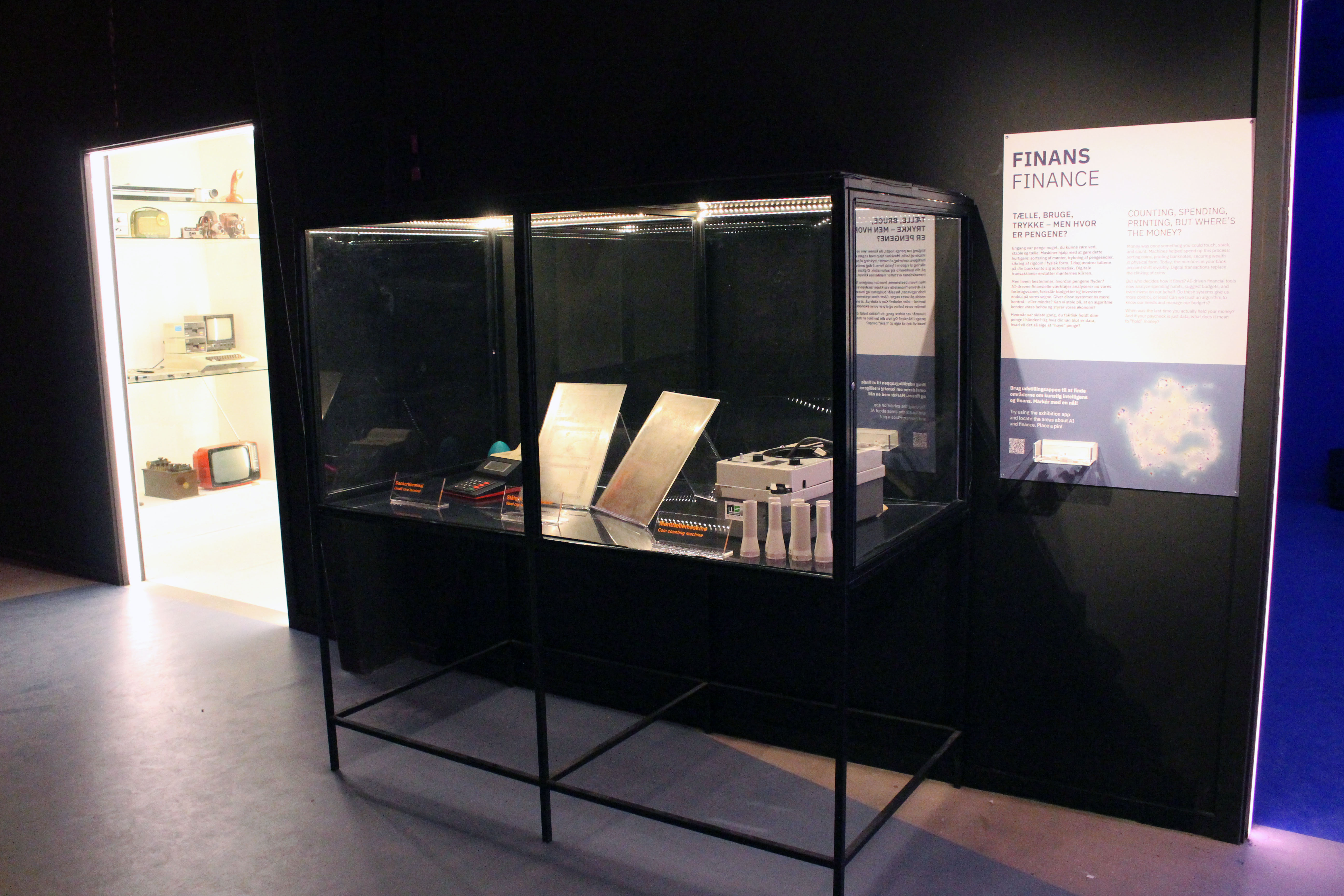
Figure 6. One of the displays placed around the Grounding AI Map, showing artifacts related to finance.
This translation is not unidirectional. It emerges from an ongoing process of negotiation between curators and researchers. The collaboration with the museum was shaped by a shared interest in experimentation. There is an early recognition that our project might not naturally align with the museum’s typical audience, yet both sides engage in a process of negotiation and adaptation. Early conversations acknowledged the potential disconnect between the map’s abstract, data-intensive content and the expectations of the museum’s general audience. What followed was a process of mutual adaptation: we brought a novel way of visualising and materialising algorithmic culture, while the curators contributed their deep expertise in public engagement. This negotiation hinged on an understanding of the museum’s visitors. The curators emphasised clarity, accessibility, and emotional resonance as guiding principles. One persona repeatedly surfaced in our conversations: the grandparent and grandchild pair. This intergenerational duo embodies the museum’s aim to provoke dialogue across age groups, often through nostalgia-driven storytelling. Exhibitions are crafted to let grandparents share memories and contexts while sparking curiosity in younger visitors. This ethos shapes many of the curatorial decisions in the museum and became central in shaping how the Grounding AI Map was presented. Even as our project introduces abstract and data-intensive content, we work to anchor it in recognizable material culture. Objects from the museum’s collection were selected to anchor abstract terms in tangible artefacts, making unfamiliar concepts accessible without diluting their complexity.
Conclusion
What emerges from the Grounding AI project is not just an exhibition, but an assemblage. The map, the artifacts, the app, the posters, and the viewers form a network of actors, each shaping how knowledge is encountered. The museum, in this configuration, is not a neutral host, it is an active ally. It provides the conditions for public learning to occur: a space of slowed-down attention, guided discovery, and embodied dialogue. This is not a dissemination of knowledge from expert to layperson, but a situated encounter with the complexity of algorithmic culture, made possible through a carefully designed infrastructure of alliance.
Crucially, this infrastructure does not aim to resolve the complexity it presents. The dialogue it enables is not a problem to be solved or a message to be decoded. It is something to be nurtured, kept alive and in motion. The inclusion of museum artifacts plays a key role here: rather than closing the gap between abstraction and experience, they hold it open. Each object adds texture and context, not to simplify the discourse, but to keep it porous, multiple, and accessible from many vantage points. This refusal to land on a single takeaway is not a lack, but rather a deliberate commitment to epistemic generosity. The exhibition invites visitors not to conclude, but to continue.
References
- Börner, Katy ; Dall’Asta, Luca ; Ke, Weimao ; Vespignani, Alessandro, Studying the emerging global brain: Analyzing and visualizing the impact of co-authorship teams, Complexity, vol. 10, n° 4, 2005, p. 57‑67. https://doi.org/10.1002/cplx.20078
- Chateauraynaud, Francis, Petit traité de contre-intelligence artificielle. Retour sociologique sur des expérimentations numériques, Zilsel, n° 5(1), 2019, p. 174‑195. https://doi.org/10.3917/zil.005.0174
- Chateauraynaud, Francis, La sociologie, le pragmatisme et la contre-intelligence artificielle. Un regard critique sur les enjeux numériques après le tournant des IA génératives, Horizon, 2024.
- Chen, Chaomei, Science Mapping: A Systematic Review of the Literature, Journal of Data and Information Science, vol. 2, n° 2, 2017, p. 1‑40. https://doi.org/10.1515/jdis-2017-0006
- Cohan, Arman ; Feldman, Sergey ; Beltagy, Iz ; Downey, Doug ; Weld, Daniel S., SPECTER: Document-level Representation Learning using Citation-informed Transformers, ArXiv:2004.07180 [cs], 2020. https://arxiv.org/abs/2004.07180
- Cover, Thomas ; Hart, Peter, Nearest neighbor pattern classification, IEEE Transactions on Information Theory, vol. 13, n° 1, 1967, p. 21‑27. https://doi.org/10.1109/tit.1967.1053964
- Dewey, John, Logic: The Theory of Inquiry, New York, Holt, 1938.
- Drucker, Johanna, Visualization, in Thylstrup, Nanna Bonde ; Agostinho, Daniela ; Ring, Annie ; D’Ignazio, Catherine ; Veel, Kristin (dir.), Uncertain Archives, Cambridge (MA), MIT Press, 2021, p. 561‑568. https://doi.org/10.7551/mitpress/12236.003.006
- Freire, Paulo, Pedagogy of the oppressed, traduit par Myra Bergman Ramos, 30\^e\^ anniversaire, New York, Continuum, 2000. (Éd. originale 1970)
- González-Márquez, Rita ; Schmidt, Luca ; Schmidt, Benjamin M. ; Berens, Philipp ; Kobak, Dmitry, The landscape of biomedical research, Patterns, vol. 5, n° 6, 2024, art. 100968. https://doi.org/10.1016/j.patter.2024.100968
- Jacomy, Mathieu ; Venturini, Tommaso ; Heymann, Sébastien ; Bastian, Mathieu, ForceAtlas2, a Continuous Graph Layout Algorithm for Handy Network Visualization Designed for the Gephi Software, PLoS ONE, vol. 9, n° 6, 2014, art. e98679. https://doi.org/10.1371/journal.pone.0098679
- Jensen, Torben Elgaard ; Birkbak, Andreas ; Madsen, Anders Koed ; Munk, Anders Kristian, Participatory Data Design: Acting in a Digital World, in Downey, Gary ; Zuiderent-Jerak, Teun (dir.), Making & Doing: Activating STS through Knowledge Expression and Travel, Cambridge (MA), MIT Press, 2021, p. 117‑136.
- Kalir, Remi ; Garcia, Antero, Annotation, Cambridge, MIT Press, 2021.
- Latour, Bruno ; Woolgar, Steve, Laboratory life: The construction of scientific facts, Princeton, Princeton University Press, 1986.
- Munk, Anders Kristian ; Madsen, Anders Koed ; Jacomy, Mathieu, Thinking Through The Databody: Sprints as Experimental Situations, in Mäkitalo, Åsa ; Nicewonger, Timothy ; Elam, Mark (dir.), Designs for Experimentation and Inquiry: Approaching Learning and Knowing in Digital Transformation, 1\^re\^ éd., Londres, Routledge, 2019, p. 110‑128. https://doi.org/10.4324/9780429489839
- Munk, Anders Kristian ; Jacomy, Mathieu ; Ficozzi, Matilde ; Jensen, Torben Elgaard, Beyond Artificial Intelligence Controversies: What Are Algorithms Doing in the Scientific Literature?, Big Data & Society, vol. 11, n° 3, 2024, art. 20539517241255107. https://doi.org/10.1177/20539517241255107
- Noichl, Mario, How localized are computational templates? A machine learning approach, Synthese, vol. 201, n° 3, 2023, art. 107. https://doi.org/10.1007/s11229-023-04057-x
- Rigal, Alexandre ; Rodighiero, Dario, Trajectoire d’une représentation cartographique en réseau, Cartes & Géomatique, n° 225, 2015, p. 33‑41.
- Rodighiero, Dario, Printing walkable visualizations, in Proceedings of the 5th Biennial Research Transdisciplinary Imaging Conference, 2018, p. 58‑73. https://doi.org/10.6084/m9.figshare.6104693.v2
- Rodighiero, Dario (avec Schnapp, Jeffrey T.), Mapping affinities: Democratizing data visualization, Genève, Métis Presses, 2021. https://doi.org/10.37866/0563-99-9
- Rodighiero, Dario ; Romele, Alberto, Reading network diagrams by using contour lines and word clouds, in Graphs and Networks in the Humanities, 2022. https://doi.org/10.31235/osf.io/3g7bt
- Rodighiero, Dario ; Wandl-Vogt, Eveline ; Carsenat, Elian ; Döring, Jules; Elias, Oliver ; Fragner, Michaela ; Farkashazy, Stepha, Immersive architectures for visual data literacy, Information Design Journal, vol. 27, n° 3, 2022, p. 295‑308. https://doi.org/10.1075/idj.22016.rod
- Schnapp, Jeffrey T., Knowledge design: Incubating new knowledge forms/genres/spaces in the laboratory of the digital humanities, Herrenhausen Conference, 5 décembre 2013. https://d-nb.info/1104703475/34
- Tukey, John W., Exploratory data analysis, Boston, Pearson, 1977.